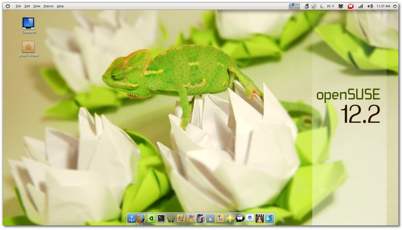
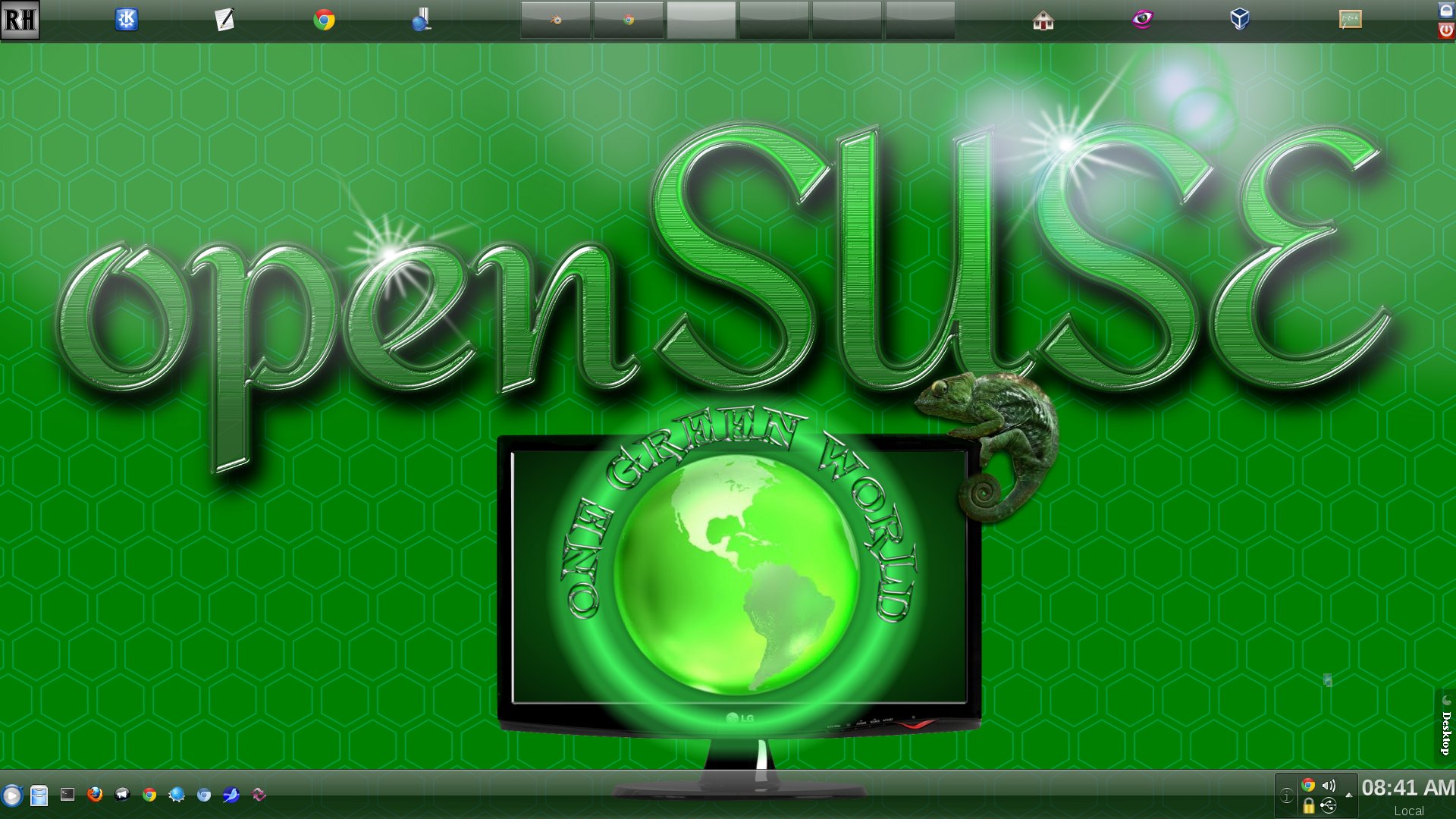
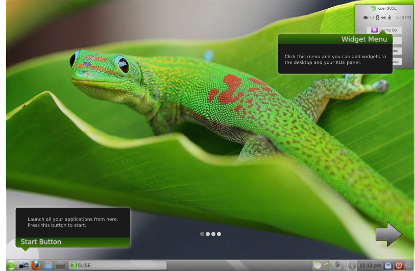
The openSUSE Artwork Team is pleased to announce the Dream openSUSE submission page. It is a place where you can submit your designs of your choice desktop customised to your needs. We all have a way to tweak and change our desktops, whether it be KDE, Gnome, or any others. We would like you to submit a screenshot of this desktop here and show us what your desktop customisations are.
All of this in preparations for future releases of openSUSE. Maybe many of the changes that you make on your own desktop can be beneficial to many other users who are trying to understand and use openSUSE but would like to have settings that fit them better. Please join us in this effort to understand the way you interact with your computer desktop.
Scott DuBois Desktop 12.1_x86_64 KDE 4.7
Http://www.thelinuxgeek.com/sites/default/files/articles/opensuse 12.1.png

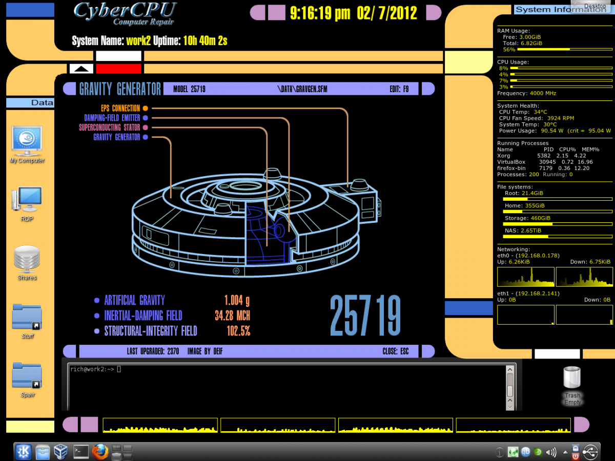
LCARS
Everything is functional using conky. The background changes every 2 hours to another random LCARS screen.
nmarques -- openSUSE 12.1 - GNOME:Cinnamon
File:jdd_desktop.jpg
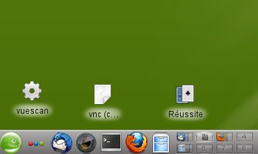
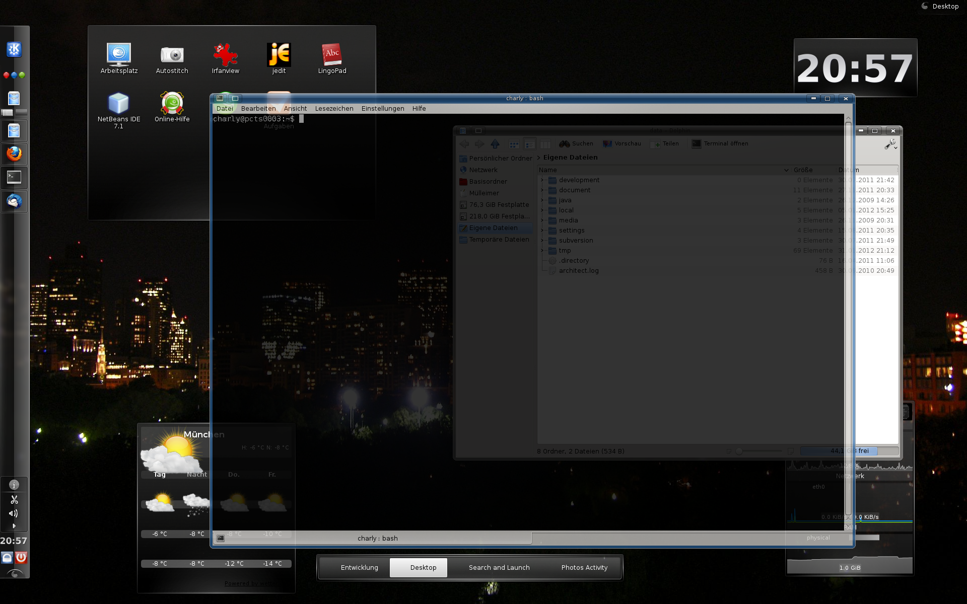
8 desktops I use 8 desktops for my regular work, and group my icons on the left of the taskbar. For some historical reasons, I have some of the icons on the background and others on the taskbar. I have many installs on many computer and often do services on other people computers, so try to keep things as near as possible from defaults - jdd
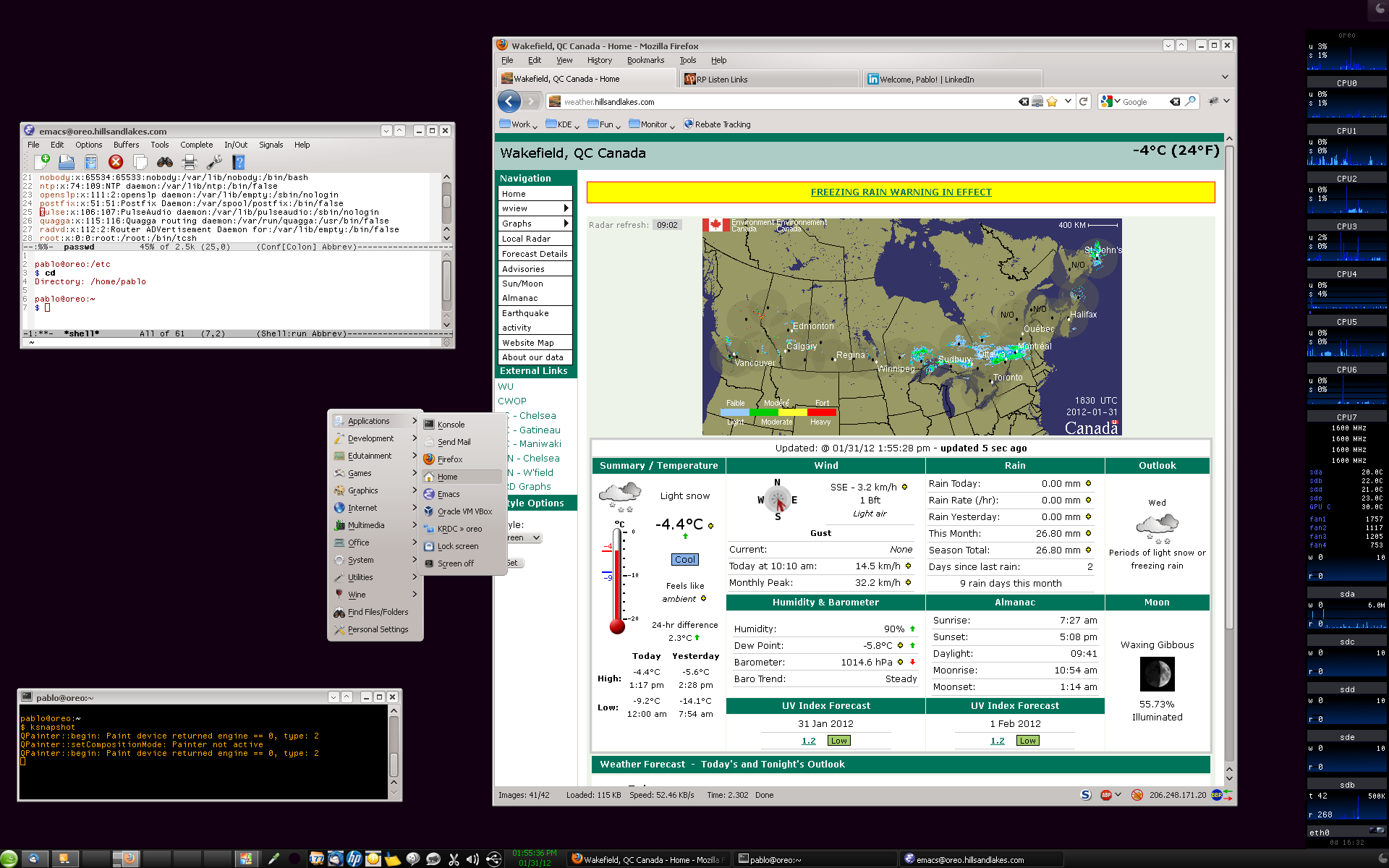
Pablo Sanchez's DesktopOne can readily see my minimalist approach. I am a bit finicky with fonts so I use Tahoma for proportional and SGI Screen for non-proportional font needs.
I find I'm more efficient to be able to left-click on my background and invoke the KDE Application Launcher. I've configured the first menu item to include my most commonly used applications.
As others, I find eight Virtual Desktops as the ideal number of desktops to support my needs. Each Virtual Desktop is dedicated to one context. If interrupted, I go to a new Desktop, perform the effort and when done, remove all windows.
Michael (mfoxdog) Fox's Desktop
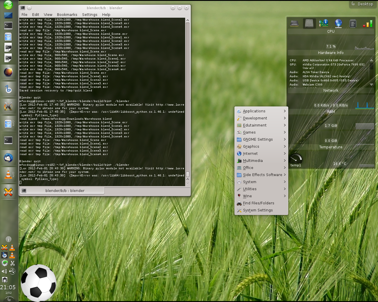
I basically use the standard KDE settings except move the panel to the leftside as i have 2 monitors (not shown in the image) and it's far easier and quicker to scan a short vertical bar than a long spanding bar, after all that's how we read a menu.
The mouse action for LMB to open the application menu for quick access to those who hide or remove the panel then they use my machine. The widgets i am using are the hardware monitors and a ball to play with when waiting for the computer to finish a task.
I also use the Slimglow Plasma theme for its minimalistic style but solid appearance to make icons and buttons easily readable.
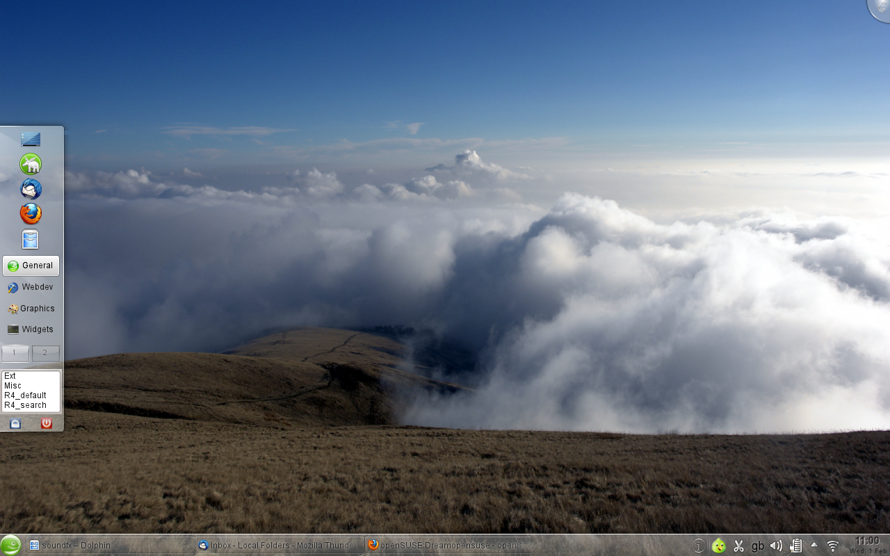
Separate taskbar and launcher panels by gumb
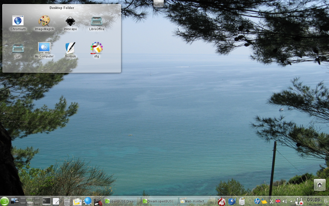
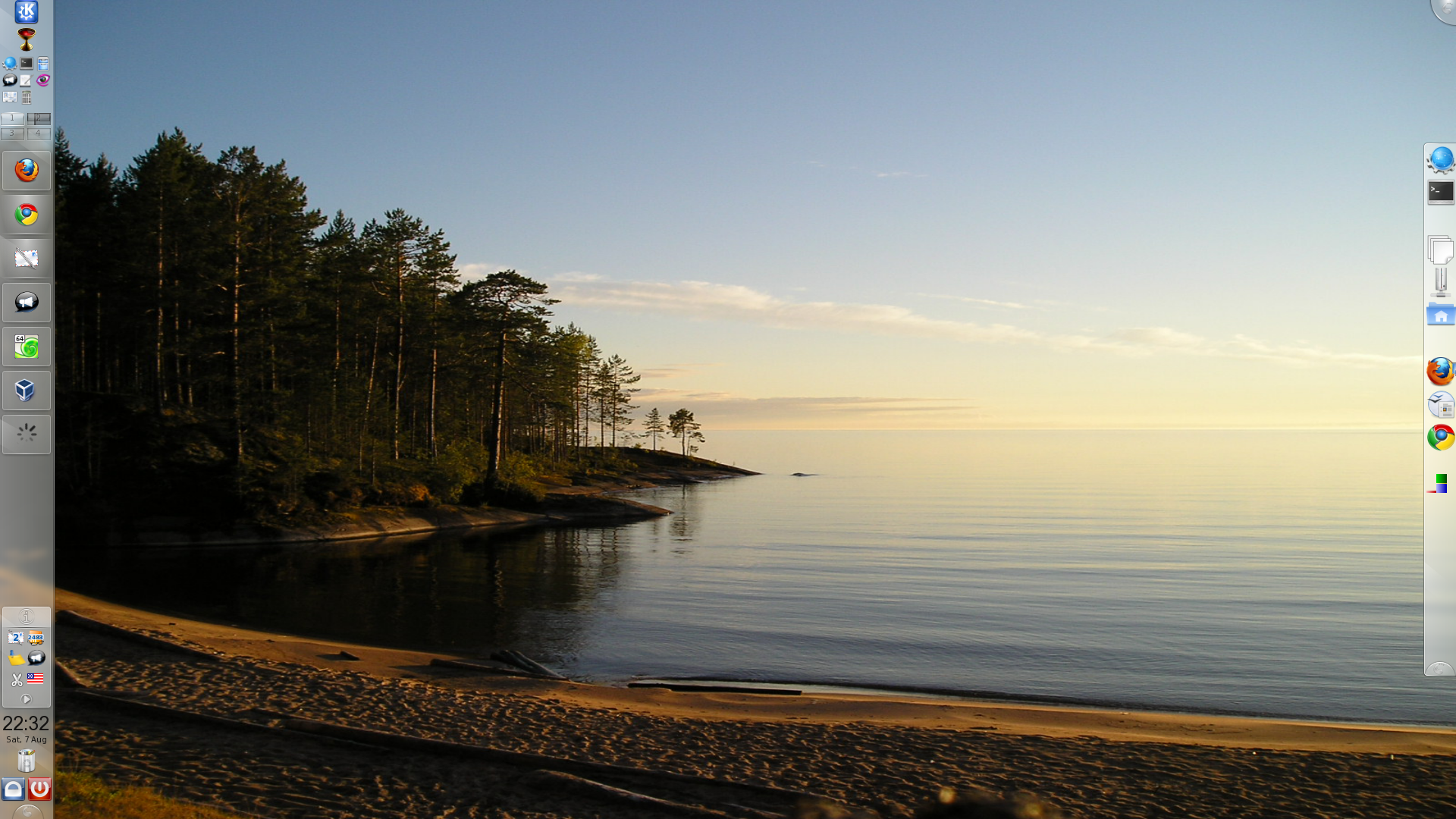
My current default KDE 4.6 desktop on openSUSE 11.4...
* On a 13 inch laptop with 1280x800 resolution, maximum vertical space wanted but task manager not practical at the sides, and I need space for when there are many entries for running programs. Twin rows of running apps looks ugly unless there's a minimum panel height. So, my default panel at the bottom is stripped to just the menu launcher and systray, freeing up horizontal space.
* Launchers and the rest (i.e. things that don't need to be visible all the time) are separated into an auto-hidden fly-out panel on the left. Tried it at the top but clashes with title bar and menu text visible underneath, and at the right it's too prone to unhiding when scrolling. Obviously the opposite would be true in a RTL environment. Shame the launcher icons at the top can't have a twin-column layout - maybe a later KDE version implements that.
* The Kate session launcher plasmoid is nifty when given enough space to expand in a panel, therefore allowing single-click access to common sessions. Also visible is the Activity switcher.
* This default activity is clean. Others have customized Folderview plasmoids relevant to the activity, whilst all other widgets (calculator, translator etc.) are housed on a separate activity.
I run most apps full-screen so desktop-based widgets and icons aren't too helpful to me. However, I'm prone to completely changing the setup every year or so as new innovations like KDE Activites mature and I find new ways of arranging / organizing things.
Richard Brown
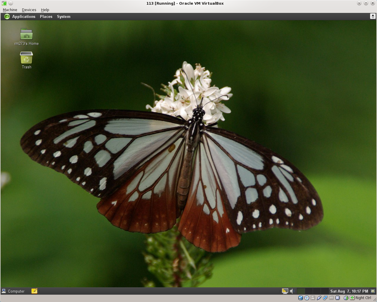
GNOME untouched
I use a standard GNOME 12.1 desktop, with the only modifications from default currently being the use of a draft 12.2 wallpaper. Also shown is 'Guake', my terminal of choice which is called by my F12 key
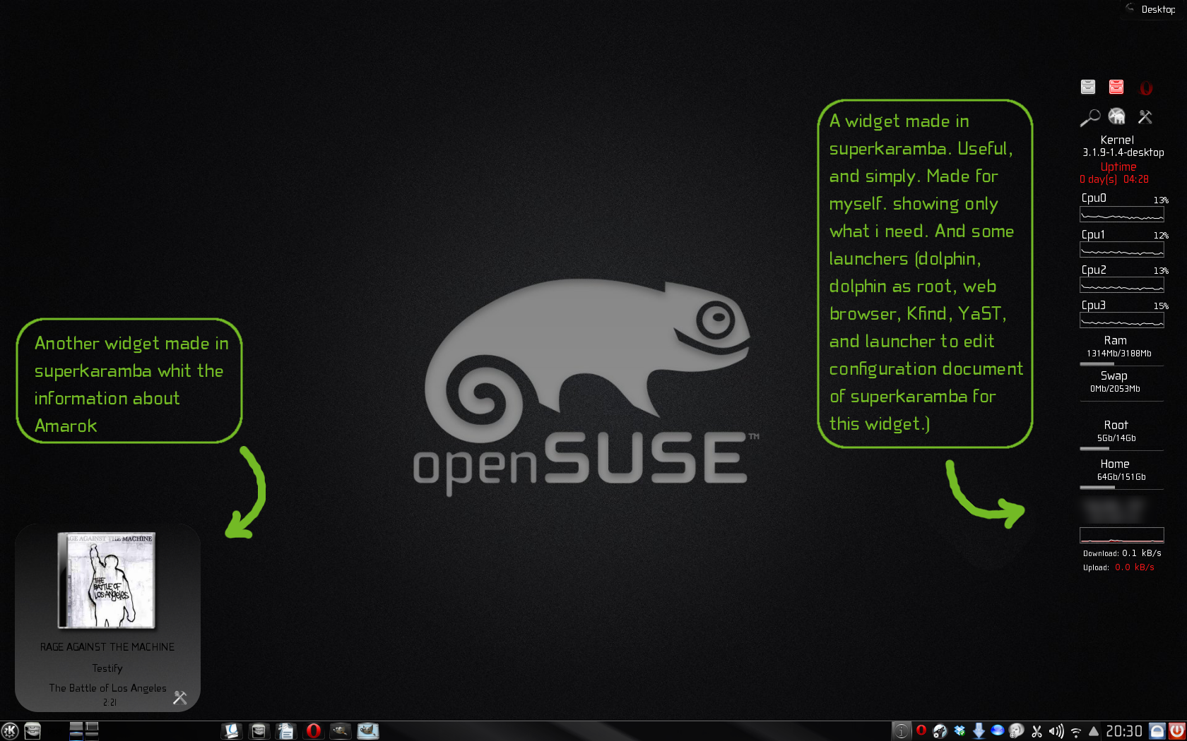
Victorhck
KDE b/w (by the moment ;) Simply desktop. Only wallpaper and a pair of superkaramba widgets. The font i use is Cholla Wide, it looks like fifth leg, is similar to that used in the openSUSE logo, isn't it? For command line i use Yakuake. And in the taskbar only icons.
luriv
KDE Desktop at the moment from PC.
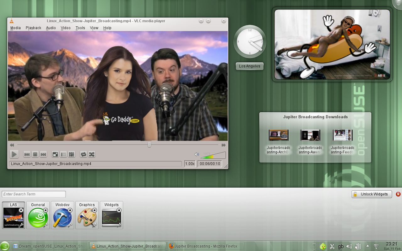
Linux Action Show KDE Activity by gumb
This is a special desktop set up for fans of the Linux Action Show. The LAS team featured this DreamopenSUSE initiative in their news section during their 195th episode, released on 5th February 2012. They requested any viewers uploading their images to this DreamopenSUSE wiki incorporate one of their videos playing on the desktop. I have gone a step further, er... okay, several steps too far, and created an entire themed KDE activity. But if it's publicity they're seeking, they should know: there's no fame without shame...
This desktop features:
* The KDE Activity bar along the bottom acting - to the delight I'm sure of Jupiter Broadcasting, as a 'lower third', even though everybody else on planet Earth but Chris knows that in fact it's more like a quarter. The 'LAS' activity has its own icon.
* A desktop folder widget provides previews and quick access to all Jupiter Broadcasting downloads.
* The analogue clock plasmoid displays the current time on the west coast of the USA, where the Linux Action Show is recorded, ensuring worldwide fans don't miss a live broadcast.
* Visible in VLC Media Player is an extract from an imaginary dream episode of the Linux Action Show, in which Bryan and Chris finally get their femme de fantasme Danica Patrick into the studio. Bryan tries his hand at being the daddy (rather too literally), much to Chris's consternation.
* Inspired by scorpions, a picture frame plasmoid features Bryan in bed with Fedora's sausage. Now that really would be a beefy miracle!
KDE General Purpose Desktop
KDE 4.7 General Purpose Use
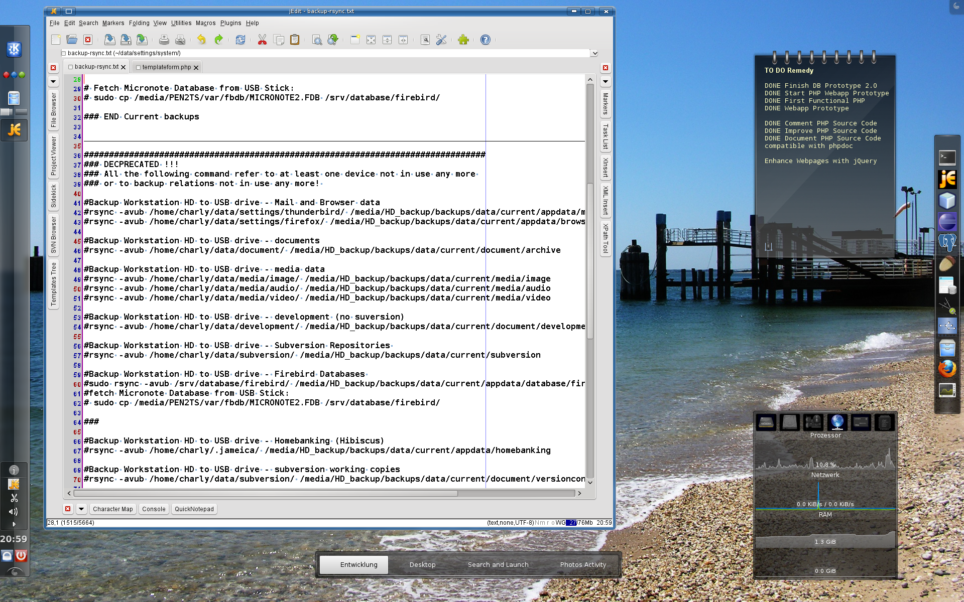
My basic desktop uses only standard elements, however, some details enhance useability a lot in my opinion: The taskbar is on the left, simply for the reason that with modern widescreen displays it is much more "expensive" to waste screen height for the taskbar than to use some of the abundant width you have.
Logout/Shutdown buttons separate from the main menu/program launcher are a must in my opinion. As a separate program launch button on the taskbar for a general purpose desktop I personally only want a file manager, everything else I need often, can be in the favorites of the main menu, e.g. browser, mail client, terminal, system settings etc.
Quite some info is provided by widgets on the desktop, only I would prefer a different way to make them visible when they are covered by lots of windows: I would like to have a control/shortcut to show them on top of the windows with the windows slightly greyed out instead of hiding all windows and showing just the desktop. This would be less interruption, if you just want a quick info in the middle of your work, I think.
I recently started to use KDE Activities, however they do not quite behave as I would wish. I would prefer it, if you had one (or more) base activities which always run. Once you start another activity, it really means starting it: opening the applications you have defined (or restoring the state when you ended it last time) in a defined layout. And when you are done you should be able to "end" the activity, meaning, that all the applications are terminated and nothing of that activity costs any performance any more. Some other details will be explained with my other following screenshot describing my development activity.
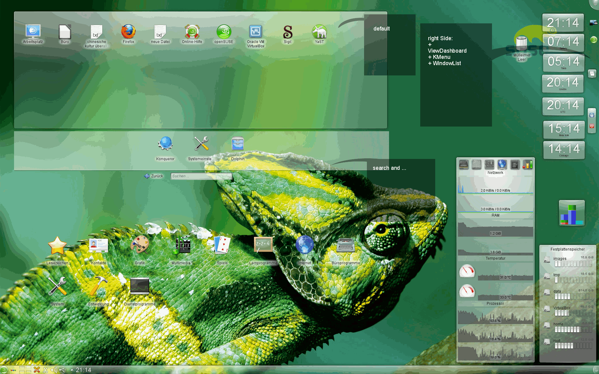
KDE 4.7 Development Activity
This screenshot shows my activity layout for development. Since the main taskbar cannot change according to different activities (that might be good), I have a separate launcher bar for the tools I need regularly while developing. Only the widget I found for that does not support slide in from the edge, which I would prefer. This way the tools would be well accessible even when the whole screen is covered by an IDE for example. The same would apply to the activity changer widget. I would be way more useful, if there was a slide in functionality.
To summarise, I personally think that it would improve usability in some places, if helpful information and controls could be shown on top of windows instead of hiding the windows. And it would be helpful, if the new conditions of widescreen displays were better taken into account.
Edit by gumb - Note to above poster:
I think the Show Widget Dashboard plasmoid (or whatever name it goes under on your version of KDE - used to be Show Plasma Dashboard) provides what you need for displaying the widgets superimposed above your windows. You can add it to your panel just the same as the Show Desktop icon, but unlike that it does not minimize everything.
If I would be using Gnome then this is what I need.
This is my Gnome dream layout. Yes is very much like pre-Unity Ubuntu, which was what I was trying to achieve, and on my surprise openSUSE had that. Not as default, but easy to find. Of course that is pre-Gnome3 openSUSE, so up to the openSUSE 11.4 you can have that.
Rajko m 20:32, 27 February 2012 (MST)
And this is one of many similar incarnations of KDE
I often have multiple panels with easy to access icons and application launchers. Currently I don't use extra panel, as I don't use Konqueror very often, but once when it had the most sophisticated editor for input boxes used on wiki, it was always present. With Kate (editor) launcher that I still use, it asked for more room then it was possible to provide with one panel.
Rajko m 20:32, 27 February 2012 (MST)
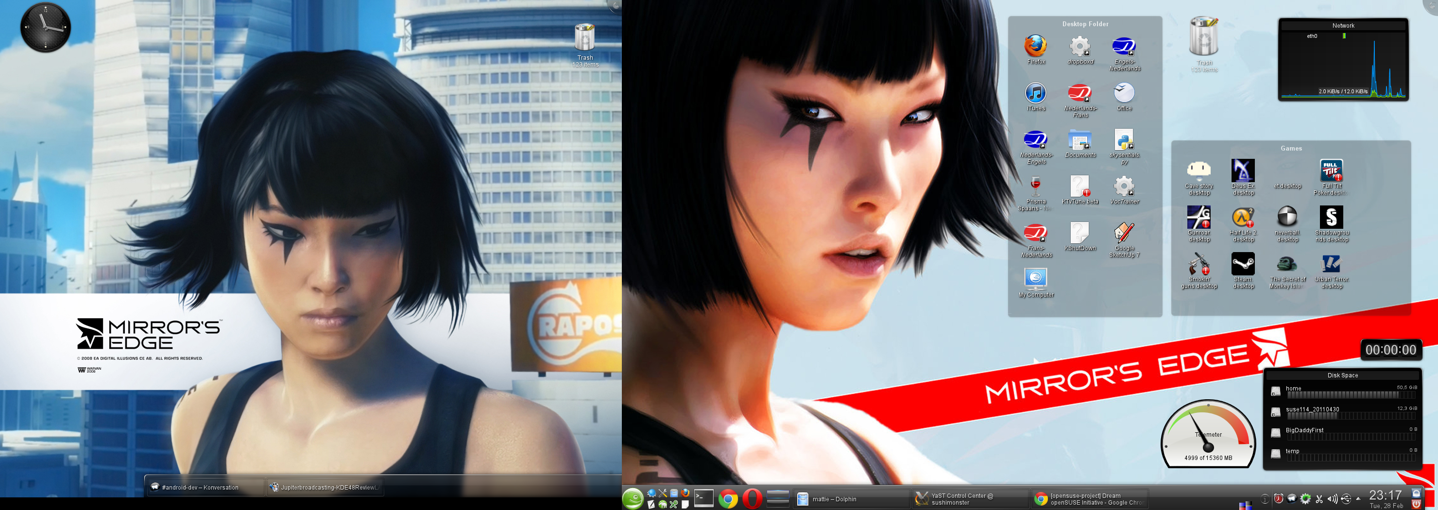
mxttie's desktop Opensuse 11.4 - KDE 4.6
- I always keep some space besides the panels to be able to quickly switch desktops by scrolling on it with the mouse.
- left screen has slideshow wallpaper
- above the disk usage widget I have the timer widget, mostly used when cooking
- on the left of the disk usage widget I have a widget I created to monitor bandwidth usage (uses ISP web service)
- I use a maximum of 2 virtual desktops which switch using the cube effect.
- Panel only shows apps on the current virtual desktop and screen.
- I move windows to another desktop by scrolling on the title bar.
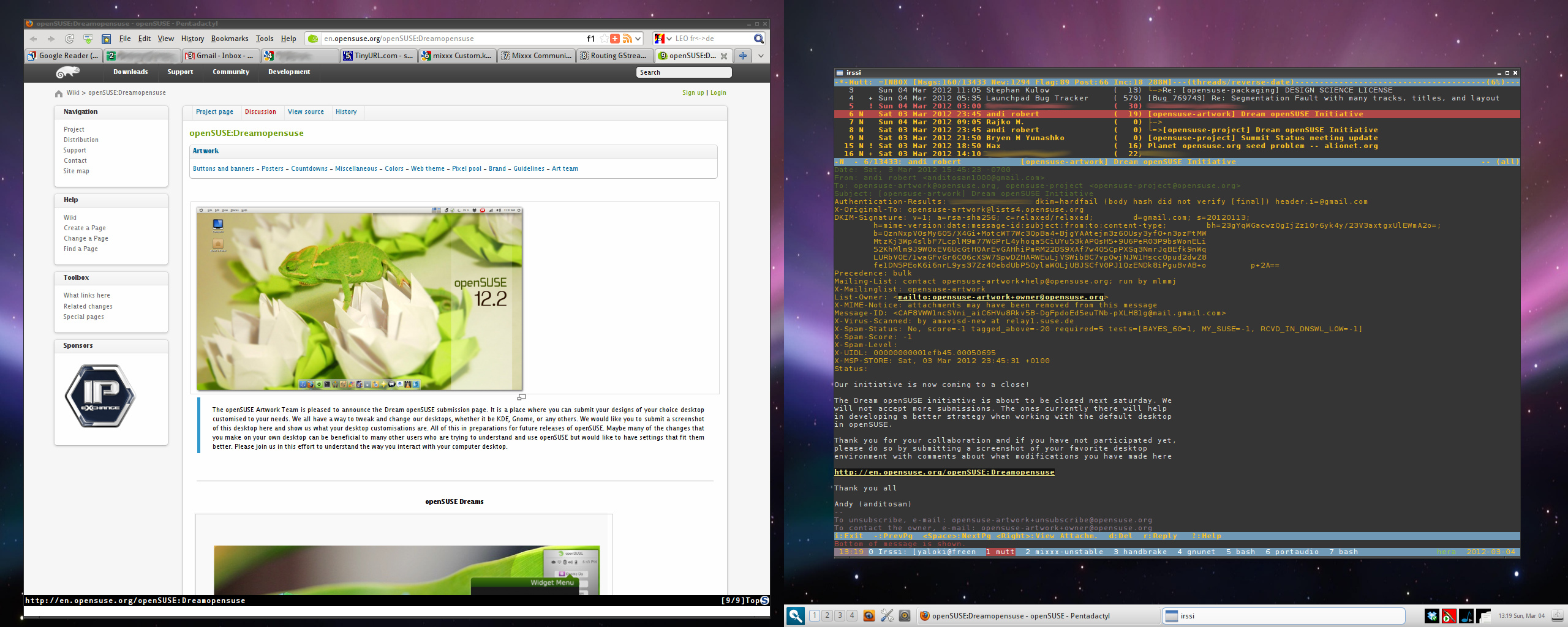
yaloki's desktop openSUSE 12.1 - razor-qt 0.4.0 with openbox 3.5.0
- after using KDE3 and KDE4 for many years (and Window Maker for many years before that), disappointed by KDE4 and not really needing any of its features, hence went with something simple, stable that fits my needs: openbox (currently with razor-qt for the taskbar and panel, but going to remove that too and replace it with tint2 or fbpanel)
- essentially just need a few windows (firefox, mixxx, eclipse, sonata, ...) and lots of terminals, all multiplexed into one screen session (screen running in rxvt-unicode)
- systray has some artifacts on the screenshot due to current transparency rendering glitches in razor-qt's panel
- wallpaper is not smooth in the middle, but that is irrelevant for me as I have two screens (which doesn't show on the screenshot ;))
- mutt for email, in screen, but thunderbird works too; irssi for IRC; vim/gvim for most editing/development (but eclipse for larger projects), mpd for music, with sonata as a frontend as well as keyboard shortcuts using mpc, configured in openbox
- four virtual desktops, but only really using one
- dual-screen through nVidia twinview
- no desktop icons (although razor-qt can do that) and the wallpaper doesn't matter much as almost all the space is always taken by e.g. firefox, rxvt-unicode with screen, etc... -- if you see your wallpaper, you're not busy enough :)
- no compositing, XGL or any other frills: result is a very stable, very fast desktop that can be tuned a lot and easily configured to use with keyboard shortcuts
Please review the Legal notice about uploading content to this wiki.
Also, be sure to consider licensing your image under the Creative Commons License. creativecommons.org
|
