openSUSE:Artwork guidelines
Audience
The target audience of the openSUSE distribution are the Linux developers, enthusiasts, and to those who are interested in having an up-to-date software. Some, however, prefer stable, supported, but perhaps a little outdated software. The style to aim for can be described with the following adjectives common for all releases:
- Fresh
- Vivid
- Dynamic
- Futuristic
- Natural
- Spacious
Layout
Always make use of whitespace. Cramming as much stuff as possible into the available space is something to avoid. Generally, separation of different elements or blocks is to be done with whitespace rather than lines or rules.
Make use of the golden ratio.
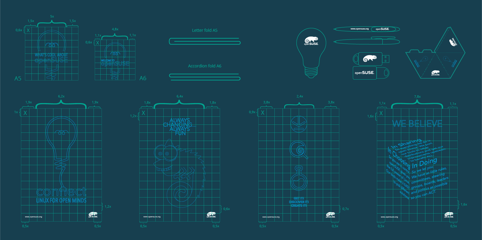
See some examples of layouts in use:
Fonts
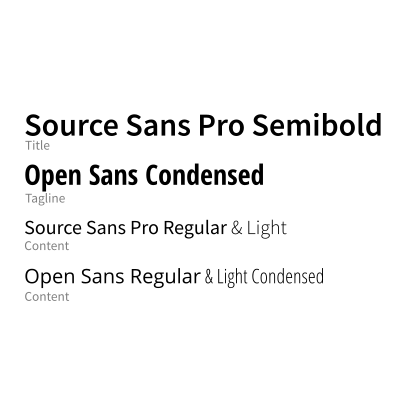
openSUSE uses open source font types in its artwork
Source Sans Pro and Open Sans
Fifth Leg font is used only with Logo or optionally openSUSE name
More details in Branding Guidelines document
Colors
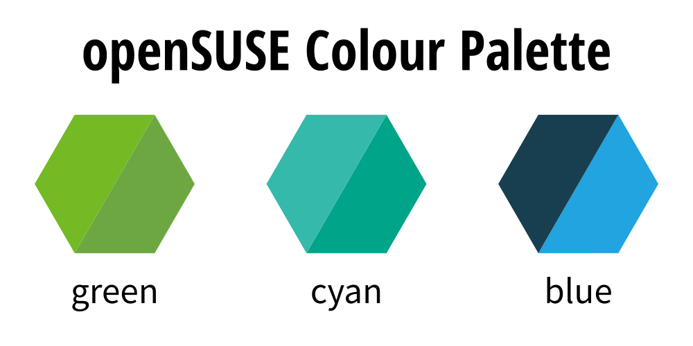
The openSUSE color palette only contains a very basic set of colors. You are not limited to using colors solely from this palette for your designs. It is however a good practice to start from these core colors and tweak the lightness of saturation to your liking rather than starting from arbitrary colors.
Colour palette download links and more information about it is available in Branding Guidelines document
Wallpapers
The goal of the default wallpaper graphic is to be unobtrusive and allow the items on the desktop to be seen. It should not hinder the overview of user's desktop. For package handlers to be able to manage the default wallpaper artwork into a variety of application packages, the artwork should be produced in an SVG format.
While a solid color background seems to be a perfect fit based on the goal above, the wallpaper also shouldn't be completely dull and boring.
It is very likely that a user will customize a wallpaper and even go against the outlined goal, putting a photo of his beloved one as the background. The default graphic however should only be some sort of abstract shape with low contrast of the texture. Abstract shapes work best for two reasons. First it doesn't make the human visual system focus on the background, but the items on top of it and also it avoids cultural or religious specifics. Using a picture of an animal might have such implications and in worst case scenario insult the user.
Icons
openSUSE is in a difficult position in that it ships a choice of two desktop environments by default -- KDE and GNOME. Each of them has historically evolved a unique style for its icons. The openSUSE user will however likely to run applications coming from both developer camps and projects completely unrelated (Firefox, LibreOffice). GNOME still uses the Tango style guidelines, creating Adwaita icons which resemble real life objects. KDE however uses Breeze icons style guide, which describes icons much simpler in style, resembling those produced by Google with their Material Design icons guidelines. This makes it hard to create icons fitting both styles.
While the differences in style (color, perspective, shadows) are significant, at toolbar and menu sizes the differences are relatively minor, due to usage of symbolic icons, and allow to overcome the need to style every single application depending on what desktop environment the user is running. Applications such as GIMP or Scribus don't look out of place when ran under either GNOME or KDE anymore.
Desktop agnostic illustrations
There are styling elements in openSUSE that are common to whether the user chose GNOME or KDE during installation -- boot select (grub), boot screen (bootsplash), help template, etc. We suggest to either avoid using icon artwork there or use simple illustrations, close to the Paper/Papirus/Typicons style.
Styling
Styling refers to custom artwork through which we define the visual coherence of the product. openSUSE is an enthusiast, community based distribution, which is reflected in the style.


