Tango

Open Source Software Style
Developer: Tango Desktop Project
License: Creative Commons Attribution Share-Alike
Web: http://tango.freedesktop.org/Tango_Desktop_Project
The Tango Team Project was create for free and open source software to develop a uniform and consistent graphical experience for user.[1] This style of icons and graphics has been adopted by many popular desktop environments and free software applications, such as GNOME and Firefox (noticeably with the release of 3.0). The need for a uniform set of icons and graphic experience comes from the differences and inconsistencies developed in the major desktop environments, such as GNOME and KDE.[2] The goals of the Tango! Project are (quoting directly from the Tango! Desktop Project's website):
- A suggested default native look.
- A subsystem to help standardize toolkits on a common icon naming structure.
- A complete set of application, mimetype, and stock icons designed using a defined style guide.
- A general, cross-desktop human interface guideline.
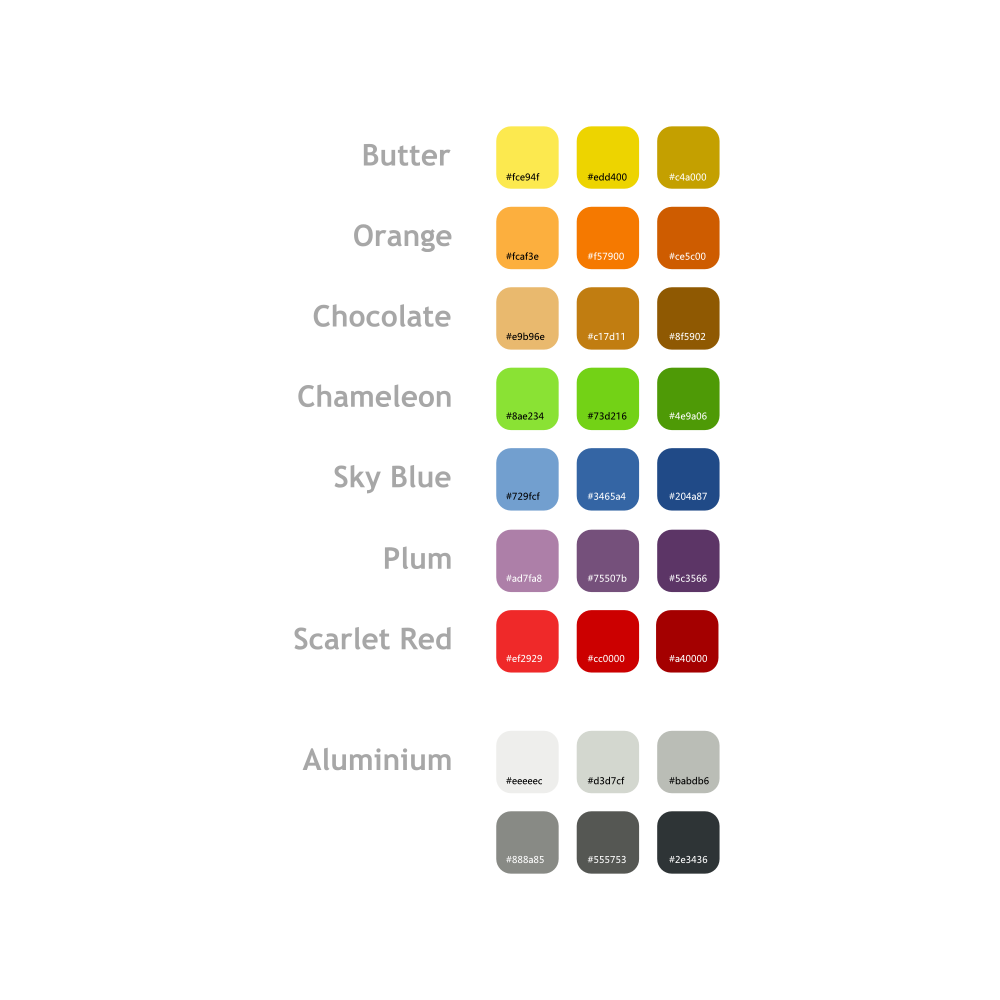
This style of graphics is based on a tri-shade palette (see below for details) which make up the color theme for the icons and images. This create uniformity among the various images and graphics created in the project. A complete style guide and tutorials for creating Tango! style icons can be found through the link below.
Color Palette
The tri-shaded color palette (the image below is property of the Tango! website) can be found to the right. This palette is used to fill the major sections of the images or icons, such as solid fill colors, gradients, highlights, etc. While many of the icons are based directly on this palette, users creating Tango! style are free to use other colors or shades, based on the ones below. Changing simple settings, such as saturation or contrast can create new colors and can make for a very unique graphics.[1] To the right can be found the official color palette. The following (also property of the Tango! website) is an example of how to properly create an icon using the Tango! color palette.
To aid in creating icons through the Tango! style, color palettes for GIMP, Inkscape (as well as other SVG vectoring programs) and Adobe Photoshop have been created. This allows the user to simply change to a Tango! color inside the program, rather than using the Dropper tool on an external color palette. Links for the various downloadable palettes can be found below, linked directly from the Tango! website.
While the Tango! style may seem very simple, it is compiled of many different factors. There factors include highlights, shadows, stroke or outline, gloss or overlay, lighting, perspective, and many others. Looking at the Gnome trashbin image above, we can see many of these elements coming together to create a visually pleasing icon. It uses a combination of outline (1), highlights (2) and a reflection or gloss effect (3). More information on this combination of factors in vectoring (Inkscape/SVG) or raster images (such as those created in GIMP or Photoshop) can be found through the link below:
There are many more elements that make up the Tango! style, and much more information that can be found on these elements. The official Tango! style guide (found through the link below) includes all relevant information needed on how to create a tango! style icon. Along with a walkthrough of how to create an icon, it also includes just as important information on what to avoid when creating a Tango! style icon, and how to make the image visually pleasing.
External Links
(All specified images are property of the Tango! website)

