openSUSE:WebYaST Style Guide/Dialog Types
Dialog Types
Dialog Types - Overview
Here is the brief overview of all kinds of YaST Dialog Types
| Dialog Type | Used For |
|---|---|
| Overview | Dialog to show an overview of items and the possibility to add/edit/delete them |
| Configuration Wizard | All kinds of dialog sequences with more than one step, e.g. adding new sound card, configuring DNS Server in three wizard steps, ... |
| Pop ups | Small window for editing few settings |
Dialog Types - Detailed Description
Overview Dialog
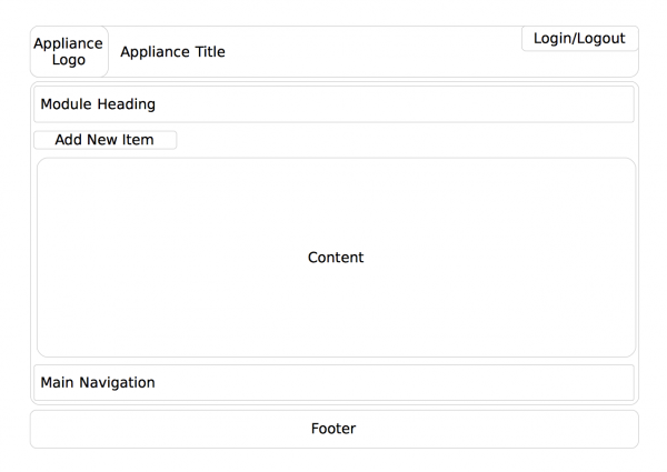
Used for listing devices, services, and other table entries providing possibility to Add new, and Edit, and Delete the current one.
Module Heading
The headline starts with "Module Name" and its icon.
The module name is consistent with the module name in „Show all“ or "Home" page.
Content
The content shows a list of detected or configured items and an "Add" button.
Add starts a configuration wizard
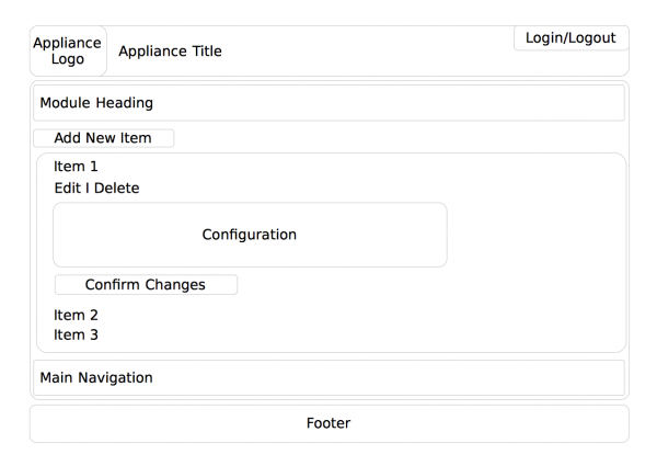
Edit and Delete are accessed when the user clicks on an item in the list.
Edit
The editable configuration options are displayed here.
If there are many options they are organized in tabs.
To ease configuration the tab headings should be consistent with headings in the configuration wizard used for adding items.
At the bottom of the "Edit" pane there are two buttons:
Save: saves changes and closes the edit pane
Cancel: discard changes and closes the edit pane
Delete
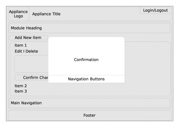
In order to delete an item from the list, the user clicks on "Delete". To make his action effective the user needs to confirm a pop up.
Demo
Try out this concept in a demo of an overview dialog
Configuration Wizard
A configuration wizard is used when
- multiple steps need to be accomplished in order to add some item or service or configuration
- no item is found and the user would be presented with a blank overview at module start up
If the add sequence consists of no more than one step use a pop up dialog instead.
Do not use tabs within the configuration wizard. A wizard per definition is a series of steps.
During the configuration wizard try to avoid using additional pop-ups.
If it is possible inform the user about the total amount of steps and the show him the step he is currently accomplishing.
If possible use the same wording for wizard steps and tabs shown in the edit section later. This makes it easier for the user to make later changes.
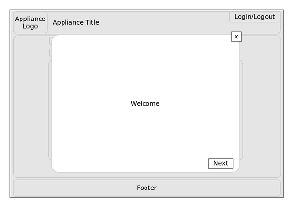
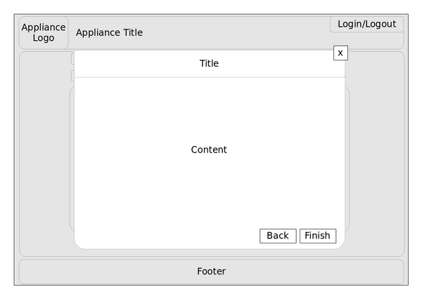
A configuration wizard is displayed on a layer above the current screen.
A wizard contains:
- introductory page
- content page(s)
- finish page
Introductory Page
The introductory page provides the user with an idea about the wizard`s goal and a short description the item to be added.
Description of buttons
- Next - Leads to the following screen
- x - Discards changes, closes the wizard and returns to module beneath the wizard
Content Page
Content pages use a headline and content area.
The headline contains the title of the configuration step. Use a summary of current settings as title.
If possible use the same wording for wizard steps and tabs shown in the edit section later. This makes it easier for the user to make later changes.
If it is possible inform the user about the total amount of steps and the show him the step he is currently accomplishing.
The content area contains the actual settings made in this step.
Description of buttons
- Back - Leads to the previous screen
- Next - Leads to the following screen
- x - Discards changes, closes the wizard and returns to module beneath the wizard
Finish Page
Finish page uses a headline and content area.
The headline contains the title of the configuration step. Use a summary of current settings as title.
If it is possible inform the user about the total amount of steps and the show him the step he is currently accomplishing.
The content area contains a summary of settings made during the use of the assistant.
Description of buttons
- Back - Leads to the previous screen
- Finish - Saves settings, closes the wizard and returns to module beneath the wizard
- x - Discards changes, closes the wizard and returns to module beneath the wizard
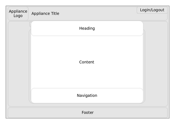
Pop up
A pop up is a small window which pops up over a parent window and where the user can edit some information.
If contains a meaningful heading, a content area and a navigation area.
The navigation area contains two buttons:
Save: saves changes and closes the pop up
Cancel: discard changes and closes the pop up
Bold text
