openSUSE:Project logo change vote
What?
openSUSE Logos
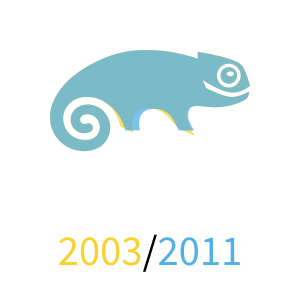
openSUSE currently uses SUSE logo from 2003 with different text under it. SUSE abandoned that logo as a part of a refresh in 2011.
openSUSE had 2 versions of the logo, the 2005 one had dual-tone text under the logo, the current one introduced in 2007-2008 is single colour throughout. The trademark application for that one was only filed in 2012 though.
The logo uses 2 different fonts: the `open` part is Cholla font, I was unable to determine what the `SUSE` part is, however it doesn't seem to match anything we have in other material.
As a sidenote to that we switched from using ® instead of ™ in the logo around 2008. ™ was nicely stylized while ® is a regular old R in a circle.
SUSE Logos
SUSE logo had the opportunity to evolve a lot throughout the years. Since the 90s they have changed their logo multiple times. The above picture doesn't show the changes in colours of the logo, those changed for a few versions, but I think we are mostly focusing on the shapes right now.
This shows the minor change done for the 2011 version of the logo to make geeko, the chameleon, stand on a little bit firmer ground, by having flatter feet.
openSUSE geeko is stretched horizontally compared to SUSE one from 2003, which is the most visible of the differences. There are some more minor changes, however they are pretty irrelevant.
For most intents and purposes, the openSUSE geeko is pretty much just old SUSE geeko from the perspective of most of everyone. The existing differences have to be explicitly pointed out for anyone to even notice, and for plenty of years people kept conflating the colours between openSUSE and SUSE (especially since SUSE used colours very similar to openSUSE for a number of years).
We also have issues with integrating the brand into secondary branding, falling back to the version of chameleon without any differentiating characteristics, at which point it's just a common logo for SUSE and openSUSE.
So what are requirements for a new logo?
- Geeko (well, chameleon, you know)
- Low detail with high recognizability (so it is well recognizable at very low resolutions)
- Logo close to 1x1, so we don't have to separate identity provided by main logo and buttons as we do currently (obviously assumed here that "openSUSE" text is gonna be a detachable part from the main body of the logo, just logo has to be 1x1, not logo + text)
The associated refresh won't cover just the logo but also the distribution logos, the artwork, the colours, the type and the websites.
Why?
It was already mentioned, but to summarize:
- Scalability of even buttons is poor, look at favicons of software-o-o and wiki
- Logo in full form is not very readable in small sizes too (even 48x48 is hard to recognize)
- Cross-branding issues with SUSE, there is still confusion about openSUSE vs SUSE (not just a logo issue)
- Logo without text needs to be able to represent the brand (Geeko represents two identities in the case when we are unable to use openSUSE/SUSE green to differentiate or text at very low sizes)
When?
Since late 2018 we have been collecting suggestions from the community in https://github.com/openSUSE/branding/issues/93
We currently have 3 community suggestions:
- https://github.com/openSUSE/branding/issues/93#issuecomment-488883914
- https://github.com/openSUSE/branding/issues/93#issuecomment-499207398
- https://github.com/openSUSE/branding/issues/93#issuecomment-714503562
Feel free to suggest more in the thread above.
After we are done with selecting one of the community suggestions, we may end up going through a few surveys to figure out the exact variant of the logo we will end up using. For 1 & 3 we have more than one variant, so that may end up being valuable.
When we are done with this, we will need to ask SUSE for a trademark for it. While that will be going, we will make 4 matching logos for distributions, new color scheme and the new landing page hopefully just in time for Leap 16.
Past discussions
Communication
Mailing list
- artwork@lists.opensuse.org - Discussions about artwork and design in the openSUSE Project.
Subscribe - Unsubscribe - Help - Archives


