openSUSE:YaST style guide
YaST Style Guide
About
The YaST Style Guide has been created to specify the look-and-feel for YaST.
This will help the developers to create their applications interfaces and to increase the consistency of YaST.
Why should I care about consistency?
Generic YaST Dialog
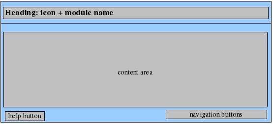
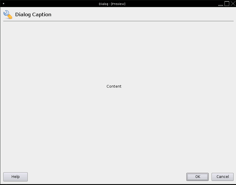
Here you can see the generic YaST dialog layout. The easiest way is to use the Wizard library that defines the layout itself and provides several functions for handling it. As we are supporting terminal screens as small as 80x25 characters make sure the module can be used at this size properly.
- Heading - Contains a meaningful dialog caption.
- Content area - To avoid too long mouse ways to the navigation buttons the content should be placed in the middle of the screen. Exceptions can be made, if a navigation tree, navigation side bar or tabs are used.
- Buttons
- Help button is down left - Clicking on the Help button opens a pop-up with appropriate help. The UI library actually handles it itself. For details see help.
- Navigation buttons are down right - See the particular Dialog Types for dialog buttons.
- If the user presses "Abort" or closes the dialog using the window decoration the module is closed. If the user made some changes, a warning pop up appears, which asks for confirmation. (The pop up can be handled by the ReallyAbort() function.)
Why should I use "Cancel" and not any other label?
Hotkeys
Hotkeys or keyboard shortcuts are a key or set of keys that perform a predefined function.
| Hotkey | Action |
|---|---|
| Alt+A | Add |
| Alt+B | Back |
| Alt+C | Cancel |
| Alt+D | Delete |
| Alt+E | Edit |
| Alt+F | Finish |
| Alt+N | Next |
| Alt+N | No (in pop up) |
| Alt+Y | Yes (in pop up) |
Function keys (F keys)
The user should be able to perform some standard actions by always using the same function key. So do not assign any other function keys than following ones
| Function Key | Action |
|---|---|
| F1 | Help |
| F2 | Info |
| F3 | Add |
| F4 | Edit/Configure/Change |
| F5 | Delete |
| F6 | Test |
| F7 | Expert/Advanced |
| F8 | Back |
| F9 | Cancel |
| F10 | Next/Finish/Accept/OK |
Dialog Types
Dialog Types - Overview
Here is the brief overview of all kinds of YaST Dialog Types
| Dialog Type | Used For |
|---|---|
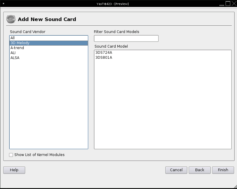
| Configuration Wizard | All kinds of dialog sequences with more than one step, e.g. adding new sound card, configuring DNS Server in three wizard steps, ... |
| Single Configuration Dialog AKA Overview Dialog | All hardware overview dialogs e.g. overview of TV cards. |
| Pop ups | Small window for editing few settings |
| Progress | Dialog to show the user that something takes time and which action is performed during this time |
| Summary | Show a summary of information to the user. Please try to avoid them. |
| Message | Inform the user e.g. about potential consequences |
Dialog Types - Detailed Description
Configuration Wizard
A configuration wizard is used when
- multiple steps need to be accomplished in order to add some item or service or configuration
- no item is found and the user would be presented with a blank overview at module start up
If the add sequence consists of no more than one step use a pop up or full-screen single configuration dialog.
Do not use a configuration wizard to edit something. Use single configuration dialog instead.
Do not use tabs within the configuration wizard. A wizard per definition is a series of steps.
During the configuration wizard try to avoid using additional pop-ups.
If it is possible inform the user about the total amount of steps and the show him the step he is currently accomplishing.
Description of buttons
- Back - Leads to the previous screen. This button is disabled on the first screen of a configuration wizard dialog.
- Next - Leads to the following screen
- Finish - On the last page within the “Add” workflow the “Next” button is replaced with “Finish”. The settings are applied.
- Cancel - If the user presses "Cancel" the module is closed. If the user made some changes, a warning pop up appears, which asks the user, if he really wants to discard his changes. The pop up is handled by really abort library.
Single Configuration/Overview/Edit Dialog
If an item/service/... has been configured, the module starts with single configuration/overview dialog. The heading consist of module name plus Overview if appropriate.
Description of buttons
- OK - The settings are applied and the screen is closed.
- Cancel - If the user presses "Cancel" the module is closed. If the user made some changes, a warning pop up appears, which asks the user, if he really wants to discard his changes. The pop up is handled by really abort library.
Pop up
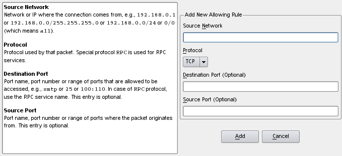
A pop up is a small window which pops up over a parent window and where the user can edit some information. There is an old Popup module or a new Yast2::Popup library that handle displaying popups. To indicate to the user that a pop up will come up, use "..." on the push button label which opens the pop up. For details see detailed pop up.
Progress
These dialogs are widely used whenever YaST module needs to inform user that some action will take some time. It informs user what's currently happening.
If a dialog appears quickly, progress dialogs can be skipped. Nice example of full-screen progress dialogs are initializing, reading and writing dialogs of the majority of YaST modules. Read dialog shows which services are read, write dialog shows which services are written, initializing dialog is kind of read dialog which is used, for instance, for probing hardware. Read and initializing dialogs are often joined into one.
For details see detailed progress
There is a Progress library that provides the functionality.
Summary
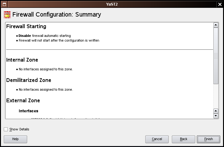
Avoid summaries if possible. If the workflow is complex, try to handle this complexity within the module design.
Why should I avoid summaries?
If it is really necessary to use a summary, it is shown at the end of a complex workflow.
It is a clearly structured overview of the choices the user made.
The user cannot edit choices in the summary.
For details see summary
Description of buttons
The dialog previous to the summary is labeled with Cancel and Next
The navigation buttons of the summary are labeled:
- Back - Leads to the previous screen.
- Finish - The settings are applied.
- Cancel - Closes the window and returns to the overview. If the user made some changes, a warning pop up appears, which asks the user, if he really wants to discard his changes. “Close” in the window decoration has the same functionality as “Cancel”
Message
Basically there are two kinds of message boxes
- Questions - handled by the Report and Popup modules or by the new Yast2::Popup library
- Messages - handled by the Report module
- Informative message
- Warning message
- Error message
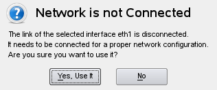
Questions and messages contain a heading, which is a one sentence summary of the information or suggested action. The user gets the essential details of the problem or suggestion. The font is bold and slightly larger than the additional information, which is a more detailed description of the problem. The additional information might be placed under the heading. It helps the user to make an informed decision. In most situations the user should only need the primary text to make a quick decision.
Questions
A "question" message box provides feedback about a situation or a condition that requires the user's decision and input before proceeding. The message is in form of a question. Write button labels as imperative verbs, for example Save, Print. This allows users to select an action with less hesitation. Try to avoid "Yes" and "No" as the only answer possibilities. If you use "Yes" and "No" the user needs to read the whole question to get a glimpse of what you want from him. By labeling the buttons meaningfully the consequences can be perceived more quickly.
There are two major kinds of question message boxes:
- Common - asks the user to decide between two conditions that don't have any effect on the system.
- Warning - asks the user a question with potentially destructive consequences.
Informative Message
It is just an informative text that YaST finds useful to show to a user.
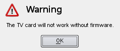
Warning Message
A warning message provides feedback about a situation or a condition. Unlike question message boxes the user is only informed and cannot make a decision about the content of the warning message. Unlike an error message it just warns users that they are performing an action which is not recommended but will not have any critical effect on the system.
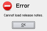
Error Message
An error message provides feedback about a critical situation or a condition. Unlike question message the user is only informed and cannot make any decision about the content of the warning message. Unlike a warning message users could harm or even destroy their system.
Dialog Elements AKA Controls
| Dialog Element | Description / Used For |
|---|---|
| InputField | One-line textual entry.
Example: Server Name. |
| CheckBox | Clickable true/false action toggle button used when both states have obvious meaning.
Use check boxes also if you want the user to select multiple options. To show the user that these check boxes belong together draw a frame around the options. If there are more than 4 options use combo box instead. |
| RadioButton | For selecting one from two or more mutually exclusive options. If there are only two obvious states use CheckBox instead.
If there are more than 4 options use ComboBox instead.
|
| CheckBoxFrame | Used similarly as a CheckBox but it additionally enables or disables another elements surrounded by the frame.
Example: One CheckBoxFrame with three another CheckBoxes inside. |
| ComboBox | For selecting one options from several ones. Possibly editable to define your own value.
Example: Selecting firewall zone for network interface (total three zones, only one can be selected). |
| Table | To show several entries with several pieces of information at once and to provide an overview.
Example: List of services allowed in firewall with their description. |
| Menu Button | A menu button is actually one button covering more possible actions at once. It is a complex element and a compromise, so try to avoid it. The main reason for avoiding it is that the user can't see the actions because they are hidden within the menu button.
Example: Selection of "Expert" settings in user and group management module. |
| Tree | Use a tree to display a hierarchical structure or if a dialog with tabs would look too crowded and complicated. When switching between the various branches changed values are preserved. If you think, that this behavior leads to potential destructive
consequences you may include a pop up, which has to be confirmed by the user. |
| Tabs | A tab is a navigational widget for horizontal switching between various settings. Use a tab to symbolize independent or hierarchically equal sections. Do not use more than five tabs or more than one row of tabs because this makes it hard for the user to find the section he is looking for and it makes your dialog look complicated and ugly. If you need more than five tabs use a Tree instead.
When switching between the various branches changed values are preserved. If you think, that this behavior leads to potential destructive consequences you may include a pop up, which has to be confirmed by the user. |
Task-Related Widgets
Task-related widgets are special groups of dialog elements that often appear together to provide a complex functionality.
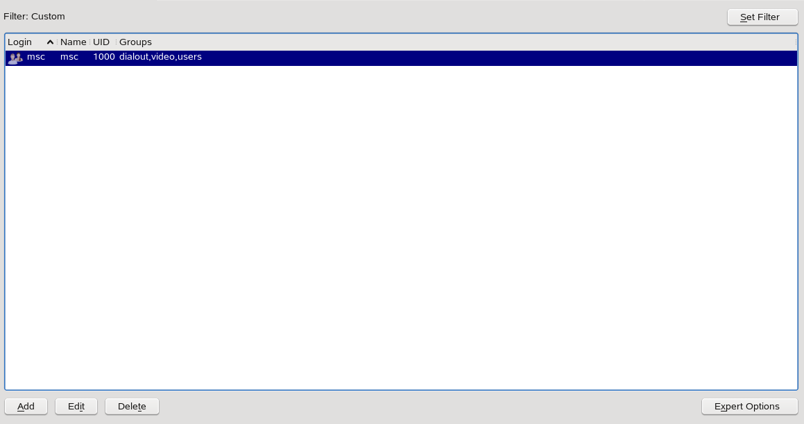
Table with Buttons
Used for listing devices, services, and other table entries providing possibility to Add new, and Edit, and Delete the current one.
Add starts a configuration wizard
Edit starts an overview dialog
Delete opens a confirmation pop up.
These three navigation buttons are aligned down left.
Down right there is place for additional buttons if they are necessary.
Search or Filter is provided at the top of the table.
Why should I use "Edit" and not any other label?
Two or More Connected Lists
Used for selecting from list of lists, e.q., for selecting Vendor and Model of a printer. Depending on what you want the user to do there are two ways how to present this information:
- browse: use a layout with two vertical columns: the column on the left side shows categorial information (e.g. vendor) and the column on the right side shows item information (e.g. model)
- search: display all vendors and models in one list and add a filter functionality on top of that list.
Text Style Guide
General
- Keep the text short and meaningful.
Capitalization
There are two systems of capitalization used in program strings: title style and sentenced style.
Sentenced style is used in:
- messages (warning, error, question,...)
- progress stages
- status bars
- help text
Title style is used in:
- headings, titles, and group labels
- input and command widgets
- module names
- progress bar labels
- status information, summaries and proposals
- trees
- tables
When capitalizing, do not change the capitalization of filenames, configuration variables, and similar casesensitive items. These should be presented in the case required by the system to avoid confusion.
Punctuation
Do not use spaces before commas (,), periods (.), colons (:), or semicolons (;). Avoid using exclamation marks at all. The wording and the type of message provide the needed emphasis. Avoid using punctuation dashes, called em dashes.
Only use "/" if it is part of a standard term, such as TCP/IP. Usually "or" or "and" should be used where a "/" is used.
Use colons as the end of combo box labels or to in overviews in a rich text field.
Spelling and Terminology
Use American English as the original language for all texts. Many words have multiple "acceptable" spellings, but it has been necessary for SUSE to standardize on certain variants for consistency. Use the first variant in Webster's dictionary as the standard spelling for anything not on these lists.
|
|
|
Help Text
General
Help needs to give the user clear directions on how to use the dialog. Also provide information about specific user input that is required, such as IP addresses, domain names, or text in a restricted character set.
Start the help with a concise paragraph describing what the dialog is all about. It should let the reader know why he would use this dialog.
If it works for your dialog, orient the help towards tasks the user may want to perform. If the layout is complex, describe the elements of the dialog. If the dialog only addresses a single task, as in the dialogs for editing configuration values, focus on the elements of the dialog. Provide background information if it is likely to be needed by the average user.
All help texts should have a heading at the top.
Formatting
- Use <big> and <b> tags for headings
- Use capitalized title-style for headings
- Put a <br> tag after each heading to make sure that only the heading is formated as a heading
- Texts should be written in paragraphs (<p> tags) using complete sentences. Do not use <br> to force line breaks. If possible, have two or more sentences per paragraph.
- Place widget labels in <b> tags.
- Use <i> tag for example values and URLs.
If you want to use the widget labels like headers when making UI-based help, place the label in <b> tags and follow it with a colon (:).
Examples
<p><b>IP Address</b>: Enter the IP address of the host, such as <i>10.1.1.100</i>.</p>
<p><b>Hostname</b>: Enter the hostname for the host, such as <i>earth</i>.</p>
